
I like many am a graphic design fanatic whether it’s logos, posters, or even motorsport liveries, I love to see a fresh look from time to time. In the NFL we have our fair share of beautiful logos, wordmarks, fonts, and uniforms.
The current Fins package, excluding the throwbacks, aren’t so great however. In this current pandemic, we don’t have much football to talk about at all. So I thought why not have a think at what a Miami Dolphins rebrand could look like.
Sadly the Dolphins aren’t allowed to change up their primary look until 2023 having changed their uniform slightly back in the 2018 offseason, but we can dream right?
I got in touch with Dan Blessing of Design Shark, who on his twitter page posted his version of what our uniforms should look like should there be a Dolphins rebrand. Dan explained to us his reasoning behind his concept.
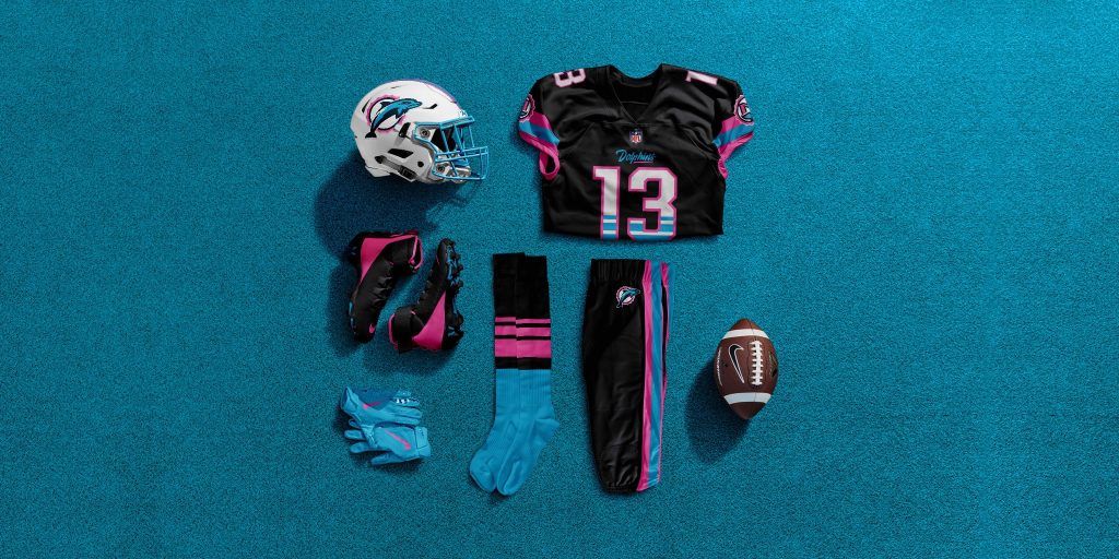
Before we do that though, let me remind you of the current Dolphins branding. Below is the current Dolphins home and away uniforms, wordmark and official colours.
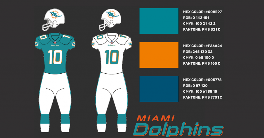
Now I’m very critical of these, the modern font, in both the numbers and bottom line of the wordmark isn’t very appealing at all. I’m more of a fan of the classic college-style numbers.
The logo is similar to how it’s always been but I’d prefer a darker orange, like the previous logo. Personally, I’m not a fan of the lighter aqua, I absolutely love the darker, more green colour we see on the alternates/throwbacks below.
That moves us on to Dan’s uniform, helmet, logo, and wordmark concepts. Earlier this week on his Twitter account, which you can follow here, Dan posted his design to his followers.
We have both a home and away colorway, as well as a Miami Vice alternate, similar to the one the Miami Heat have. Below you can see his concept.
Dan Blessing’s Miami Dolphins Rebrand
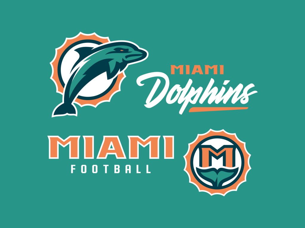

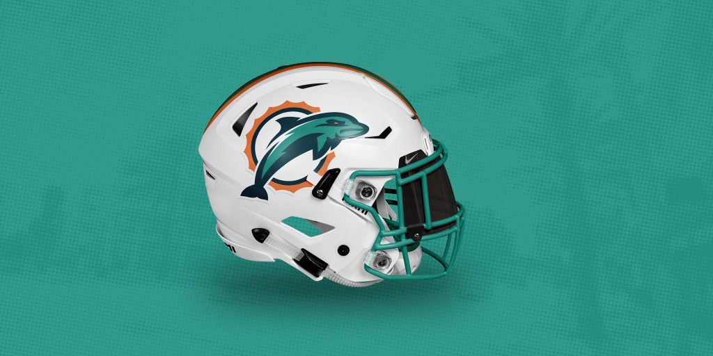

Let’s start with the logo, Dan told me ” I understand the need to get ‘sleeker’ and more ‘modern’ but I wasn’t a fan of the current logo as I think it was missing character.”
In Dan’s words, “I opted to modernize the previous dolphin logo used in the 70s and made it a little more aggressive. Dolphins are naturally not aggressive animals so too much aggression and I think it would look cheesy so it was a balancing act.”
That meant that in his Dolphins rebrand, Dan created two different logos to go within that theme. One which would act as the official team logo and one for branding and clothing purposes. The M Tail Icon is in place to accompany the more traditional sports logo.
He stated “I wanted to create an icon that was designed more in the realm of ‘lifestyle branding’ that was inspired by Miami. Therefore, I kept it simple and designed an ‘M’ that sits on top of the tail in the same sunburst as the dolphin to create cohesion. I believe this secondary logo would look great on hats, tees, and other apparel.”
To accompany the new logo, Dan’s produced a new Miami Dolphins wordmark which has a retro but lively feel to it. He told me ” Miami is a very lively city with a lot of character so I thought a more intense script was in store to represent the fast-paced and unique nightlife of the city.”
Finally, his Block ‘Miami’ Wordmark pays homage to the highly successful Fins teams in the 1980s but also integrates a bold and aggressive sports-type.
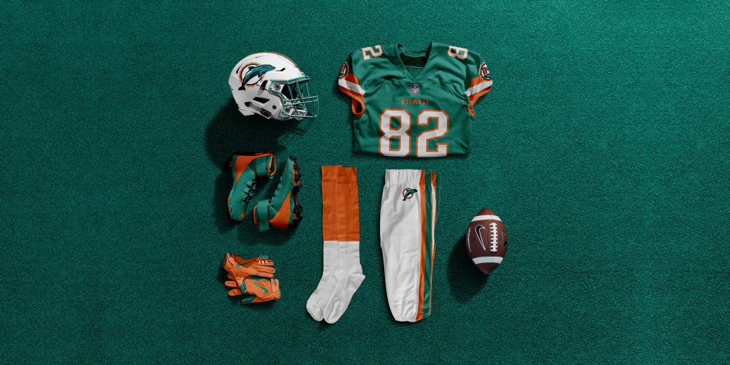
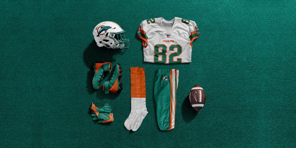
Let’s now take a closer look at his proposed home uniform. In our conversation earlier, Dan started with “Ideally the Dolphins would make their throwback branding that they wear 1-2 times a year their primary… however since they won’t, I think a rebrand on their current set is the next best thing.”
Straight away I see stripes on the sleeves which is another one of my favourite features from the throwback alternate. There’s also a darker colour to the base of the jersey, just like in the throwbacks too.
I like the colour of the facemask and the old school font on the number and ‘Miami’ wording, two things I’d love to see if there were to be a Dolphins rebrand. There’s also the secondary M Tail Icon on the sleeve, which is similar to what we see on the side of many NFL jerseys, such as the Baltimore Ravens’ Maryland shield.
The white pants are simple and retro, with the orange-aqua-orange stripe down the side, whilst the new logo features on the hip. Finally, the simple half and half orange and white socks show off more of the secondary colours.
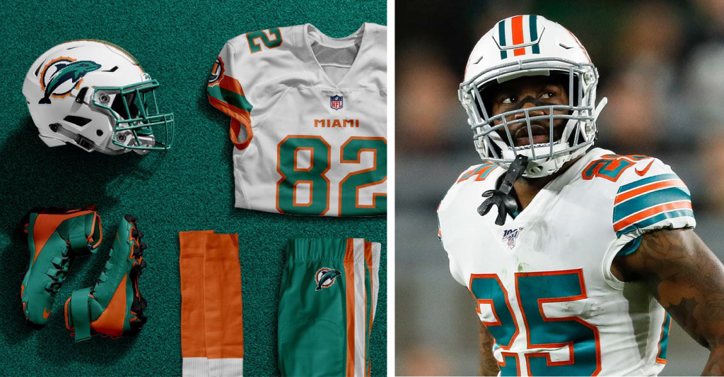
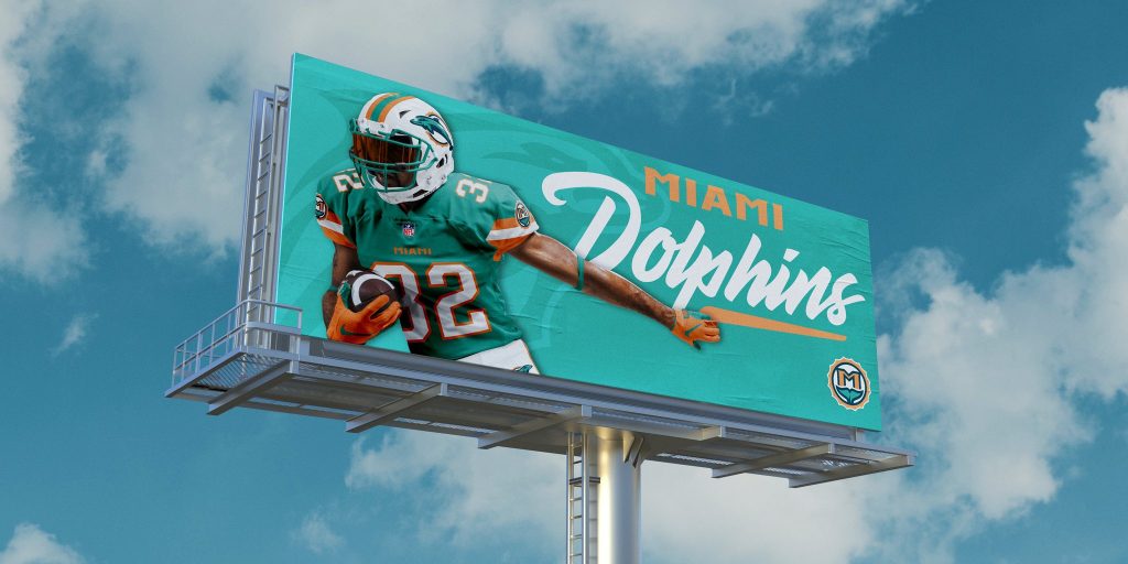
Dan’s away uniform in his proposed Dolphins rebrand is essentially the exact reverse of the home outfit, but that’s not a bad thing whatsoever. This jersey has more to it than the away throwbacks (pictured right), because of the socks, pants, and facemask being coloured.
The orange on the edge of the sleeve blends well with the orange-aqua-orange stripe and the M Tail Icon, whilst the half and half socks make a return. The block wordmark adds a little more to the front of the jersey.
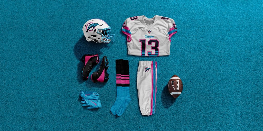
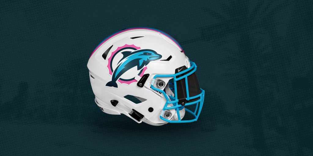
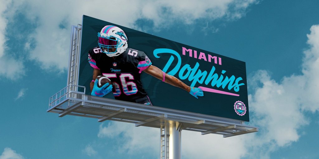
Dan also produced a Miami Vice alternative to these uniforms for his Miami Dolphins rebrand. Fans have been calling out for this for a while now, as the Miami Heat ‘Vice’ City NBA Jerseys have proved incredibly popular.

Those very jerseys are available for your eyes, above. Dan’s done a great job converting his original design to fit with the ‘Miami Vice’ colour palette. He told me “I wanted to explore a ‘Miami Vice’ color palette which used light blue and bright pink accompanied by 80s style details in the uniforms that paid homage to the show “Miami Vice”.
The light blue and bright pink compliment the ‘home’ black uniform and the white ‘away’ one very nicely, as you’d expect. Those colours make up the special helmet, replacing the aqua and orange, but not looking out of place.
What would you like to see from a Miami Dolphins rebrand? Let us know on social media.
For more like this, you can visit our opinion section. Also, follow us on Facebook and Twitter for news, views, competitions, and much more.